In this section, learn about how to read the graphs on the dashboard.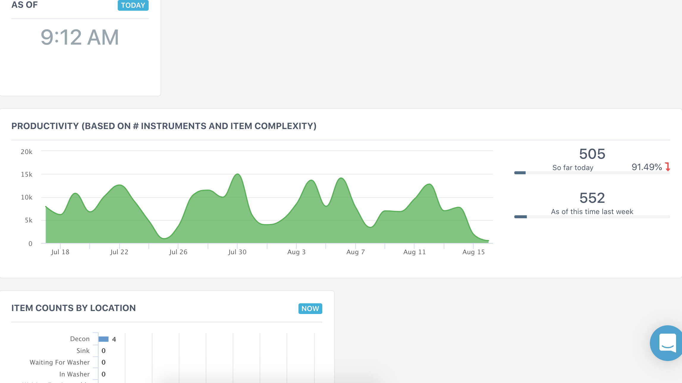
As of *Time*
This is the time in which the dashboard you are viewing was last updated. This refreshes every five minutes.
Productivity Graph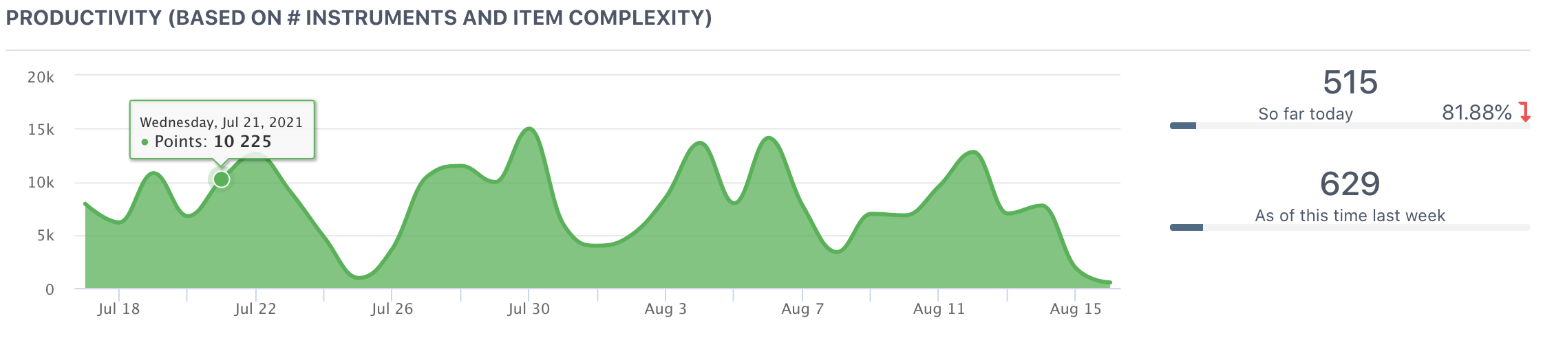
Hover your arrow over the graph to see specific data points.
X Axis
The date, which spans over the last four weeks.
Y Axis
Productivity points, which is a calculation by our analytics team based on items sterilized. The calculation weighs in item instrument quantity and assembly complexity.
So Far Today...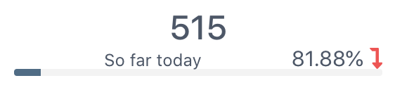
The quantity of points in the day and a comparison to this day's total last week. As the daily points build, the percentage will drop. Once the facility reaches equal production to this day last week, the percentage will build with a green arrow.
As of This Time Last Week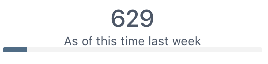
The quantity of points in the day that the facility had as of this time one week ago.
Item Counts By Location
View items last scan point t get a picture of how much work is needed in specific areas of reprocessing.